Let the walk through the space set the rhythm
Stand at both ends of your hallway before choosing a layout. A regular row leads the eye forward and makes the walk feel longer; a compact grid creates a place to pause; a loose salon wall rewards a slower look. You do not have to cover the entire wall. In a narrow passage, the empty stretches between a doorway and the first frame are part of the composition.
Seven moods, not seven rules
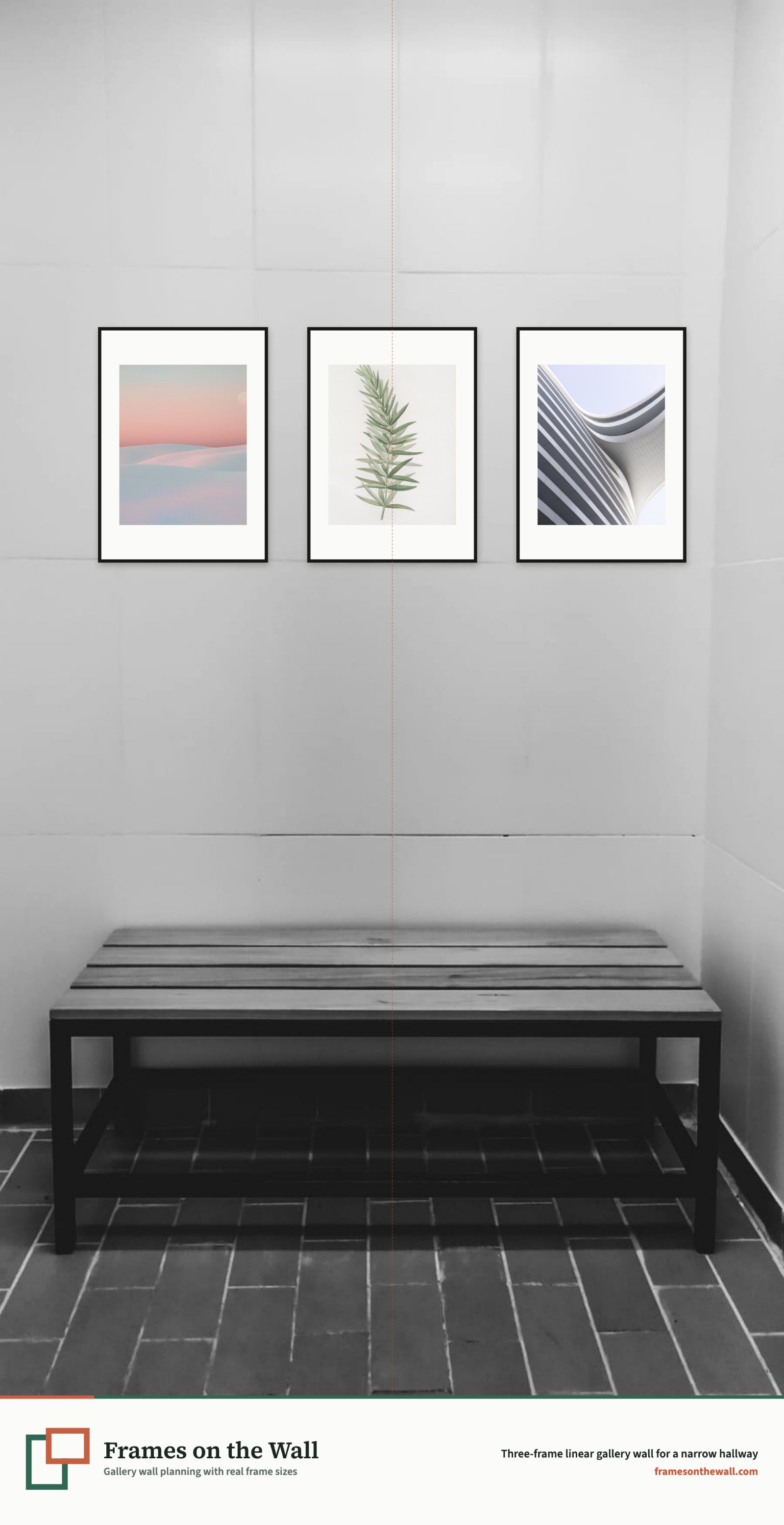
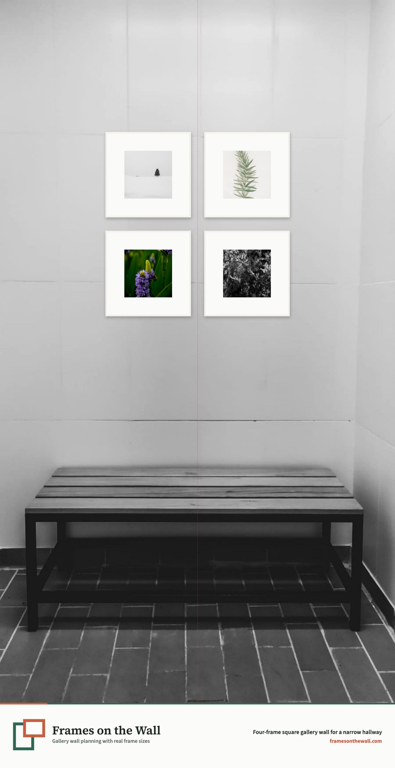
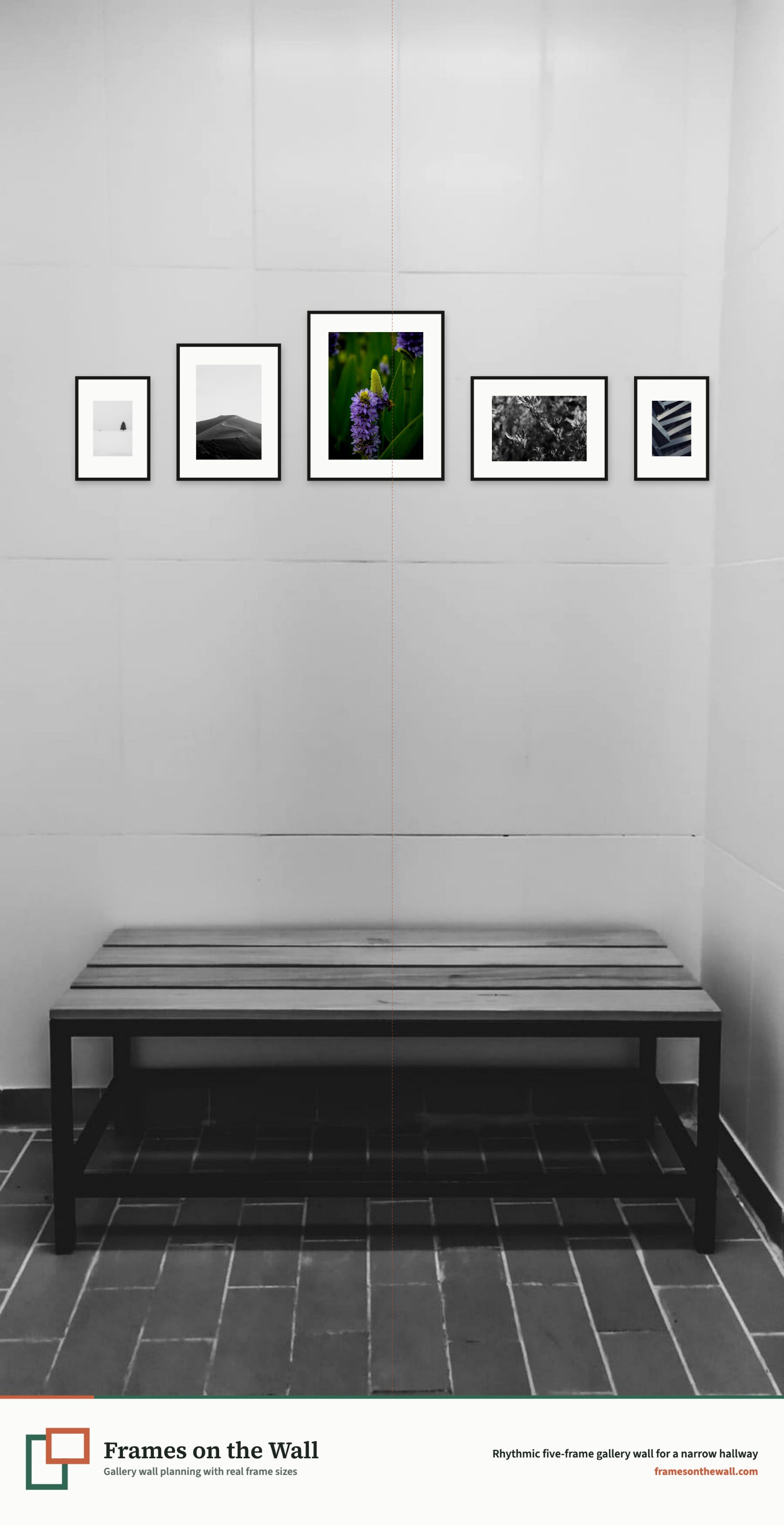
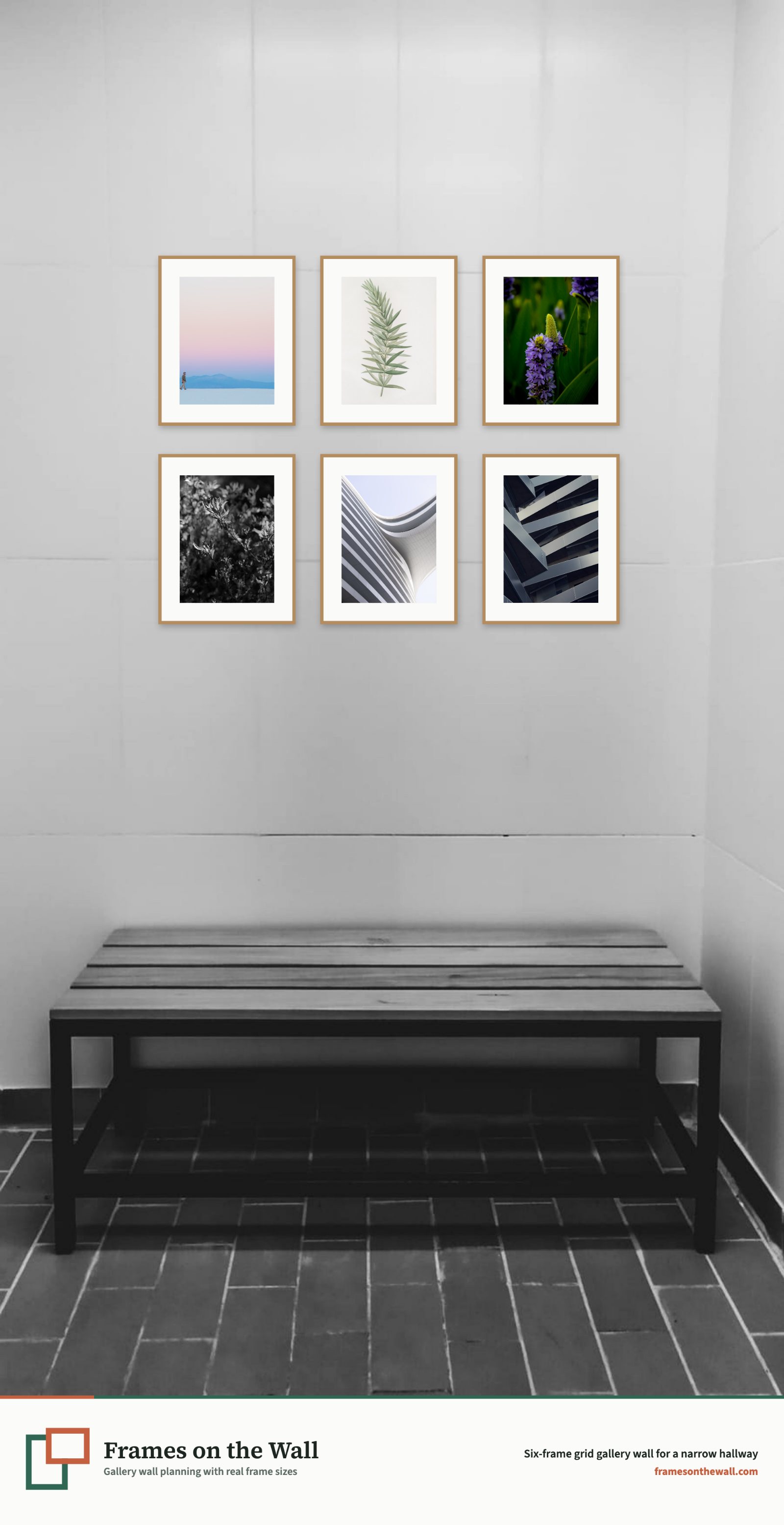
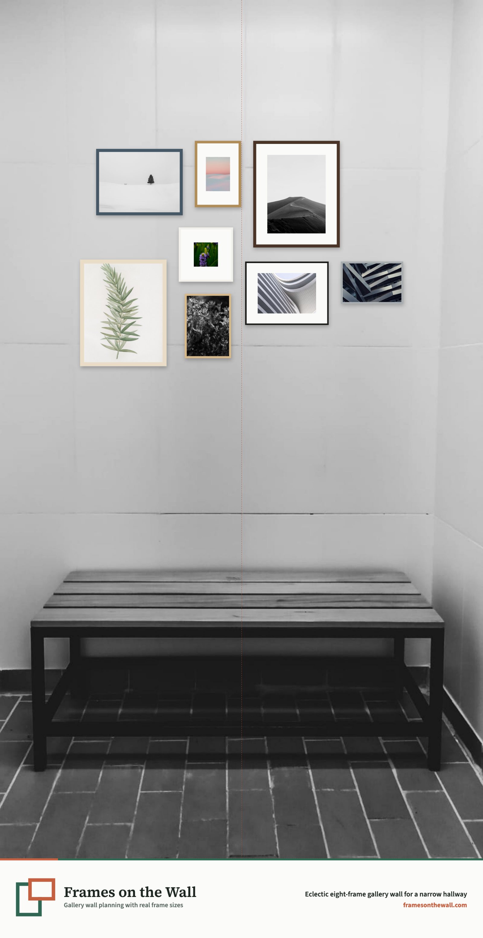
Choose the three large frames when the artwork shares a palette and deserves breathing room. Pick the square or oak grid for a more architectural look, the five-frame line for a playful cadence, or the eight-frame salon for a collection that can grow over time. Then replace our hallway with your own photo and adjust the scale, spacing and sightline until it feels right from both directions.
Let the wall colour join the composition
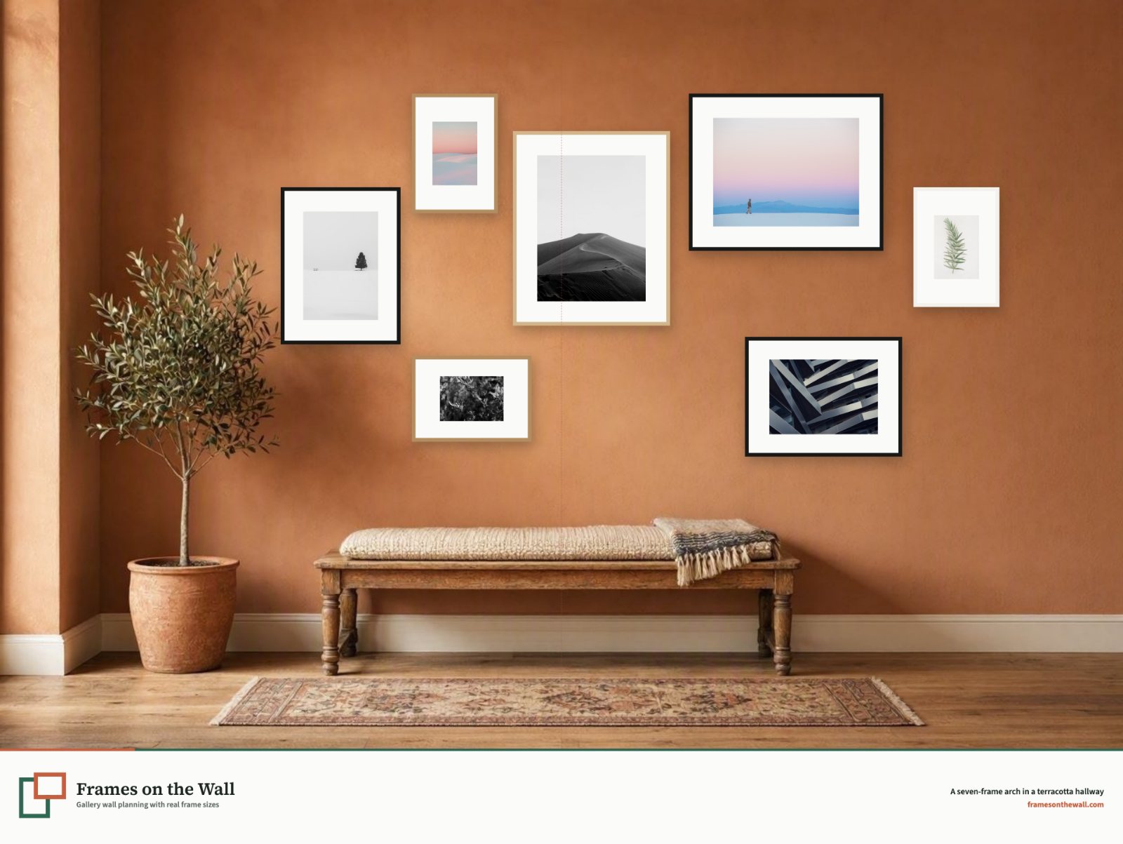
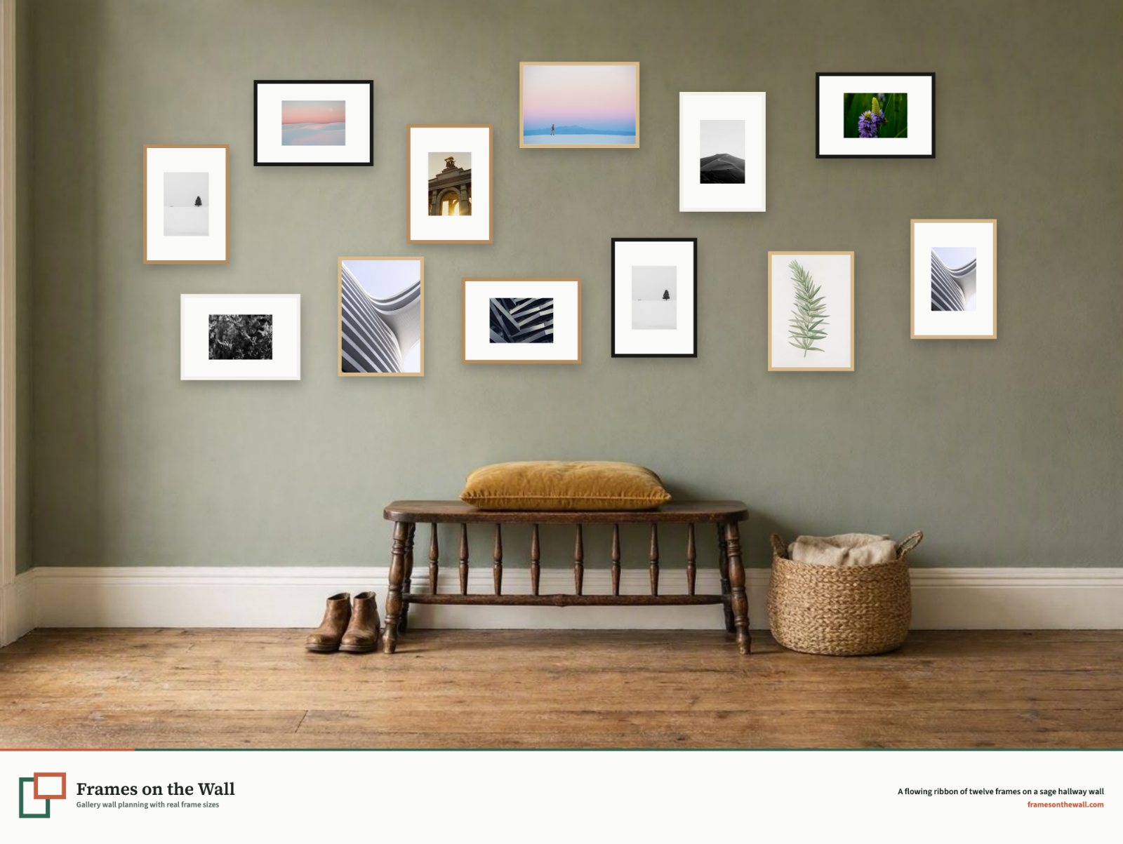
Terracotta makes black and pale wood frames feel graphic and sun-warmed; sage softens a larger collection and lets white mounts breathe. We would recommend you upload a photo of your real wall in our design tool. However, if you want to experiment with different background colours for your wall, this is also possible. Visualising what a gallery wall and wall colour will look like is really the best way to avoid regrets.